Data table histograms
The EventTable object comes with a hist() method, allowing
trivial generation of histograms using any column as the counter:
- EventTable.hist(column, **kwargs)[source]
Generate a
HistogramPlotof thisTable.- Parameters:
- Returns:
- plot
Plot The newly created figure.
- plot
See also
matplotlib.pyplot.figurefor documentation of keyword arguments used to create the figure.
matplotlib.figure.Figure.add_subplotfor documentation of keyword arguments used to create the axes.
gwpy.plot.Axes.histfor documentation of keyword arguments used to display the histogram, if the
methodkeyword is given, this method might not actually be the one used.
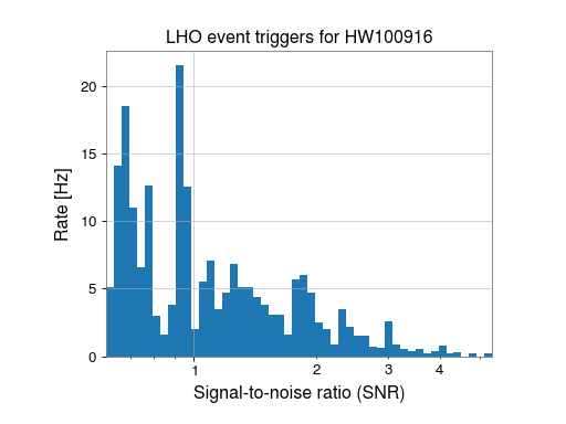
Using the above method we can generate a histogram as follows
>>> from gwpy.table import EventTable
>>> events = EventTable.read('H1-LDAS_STRAIN-968654552-10.xml.gz', tablename='sngl_burst', columns=['snr'])
>>> plot = events.hist('snr', weights=1/10., logbins=True, bins=50, histtype='stepfilled')
>>> ax = plot.gca()
>>> ax.set_xlabel('Signal-to-noise ratio (SNR)')
>>> ax.set_ylabel('Rate [Hz]')
>>> ax.set_title('LHO event triggers for HW100916')
>>> ax.autoscale(axis='x', tight=True)
>>> plot.show()
(png)

This is a snippet from the example Plotting an EventTable in a histogram.