Note
Go to the end to download the full example code.
Plotting an averaged ASD with percentiles.
As we have seen in sphinx_glr_examples_frequency_hoff, the Amplitude Spectral Density (ASD) is a key indicator of frequency-domain sensitivity for a gravitational-wave detector.
However, the ASD doesn’t allow you to see how much the sensitivity varies over time. One tool for that is the spectrogram, while another is simply to show percentiles of a number of ASD measurements.
In this example we calculate the median ASD over 2048-seconds surrounding the GW178017 event, and also the 5th and 95th percentiles of the ASD, and plot them on a single figure.
Data access
First, as always, we get the data using TimeSeries.fetch_open_data():
from gwpy.timeseries import TimeSeries
hoft = TimeSeries.fetch_open_data("H1", 1187007040, 1187009088)
Calculate spectrogram
Next we calculate a Spectrogram by calculating
a number of ASDs, using the spectrogram2()
method:
sg = hoft.spectrogram2(fftlength=4, overlap=2, window="hann") ** (1 / 2.)
From this we can trivially extract the median, 5th and 95th percentiles:
median = sg.percentile(50)
low = sg.percentile(5)
high = sg.percentile(95)
Visualisation
Finally, we can make plot, using plot_mmm() to
display the 5th and 95th percentiles as a shaded region around the median:
from gwpy.plot import Plot
plot = Plot()
ax = plot.add_subplot(
    xscale="log",
    xlim=(10, 1500),
    xlabel="Frequency [Hz]",
    yscale="log",
    ylim=(3e-24, 2e-20),
    ylabel=r"Strain noise [1/$\sqrt{\mathrm{Hz}}$]",
)
ax.plot_mmm(median, low, high, color="gwpy:ligo-hanford")
ax.set_title("LIGO-Hanford strain noise variation around GW170817")
plot.show()
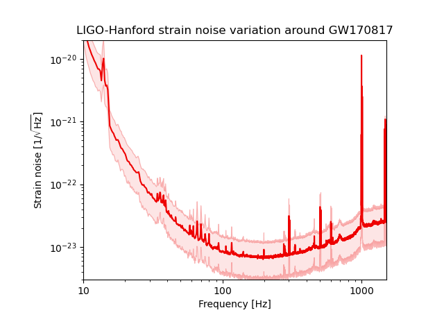
Now we can see that the ASD varies by factors of a few across most of the frequency band, with notable exceptions, e.g. around the 60-Hz power line harmonics (60 Hz, 120 Hz, 180 Hz, …) where the noise is very stable.
Total running time of the script: (0 minutes 3.530 seconds)