Note
Go to the end to download the full example code.
Generating a SpectralVariance histogram
The most common visualisation of the spectral content of a data series is via the power or amplitude spectral density calculations (PSD or ASD). However, these typically involve averaging of the data over a period, which can wash out transient noise (as is often desired).
The SpectralVariance histogram provide by gwpy.frequencyseries allows
us to look at the spectral sensitivity in a different manner, displaying
which frequencies sit at which amplitude most of the time, but also
highlighting excursions from normal behaviour.
To demonstate this, we can load some data from the LIGO Livingston interferometer around the time of the GW151226 gravitational wave detection:
from gwpy.timeseries import TimeSeries
llo = TimeSeries.fetch_open_data("L1", 1135136228, 1135140324)
We can then call the spectral_variance()
method of the llo TimeSeries by calculating an ASD
every 5 seconds and counting the amount of time each frequency bin spends
at each ASD value:
variance = llo.spectral_variance(
    5,
    fftlength=2,
    overlap=1,
    log=True,
    low=1e-24,
    high=1e-19,
    nbins=100,
)
We can then plot() the SpectralVariance
plot = variance.plot(yscale="log", norm="log", vmin=.5, cmap="plasma")
ax = plot.gca()
ax.grid()
ax.set_xlim(20, 1500)
ax.set_ylim(1e-24, 1e-20)
ax.set_xlabel("Frequency [Hz]")
ax.set_ylabel(r"[strain/$\sqrt{\mathrm{Hz}}$]")
ax.set_title("LIGO-Livingston sensitivity variance")
plot.show()
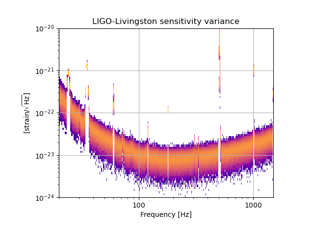
From this we see that in general the sensitivity varies a few parts in
10:sup:-23, while many of the lines (narrow-band peaks in the spectrum)
are much more stationary.
Total running time of the script: (0 minutes 3.470 seconds)