2. Plotting a normalised Spectrogram
The previous example showed how to
generate and display a Spectrogram of the LIGO-Hanford
strain data around the GW150914 event.
However, because of the shape of the LIGO sensitivity curve, picking out features in the most sensitive frequency band (a few hundred Hertz) is very hard.
We can normalise our Spectrogram to highligh those
features.
Again, we import the TimeSeries and call
TimeSeries.fetch_open_data() the download the strain
data for the LIGO-Hanford interferometer
from gwpy.timeseries import TimeSeries
data = TimeSeries.fetch_open_data(
    'H1', 'Sep 14 2015 09:45', 'Sep 14 2015 09:55')
Next, we can calculate a Spectrogram using the
spectrogram() method of the TimeSeries over a 2-second stride
with a 1-second FFT and # .5-second overlap (50%):
specgram = data.spectrogram(2, fftlength=1, overlap=.5) ** (1/2.)
and can normalise it against the overall median ASD by calling the
ratio() method:
normalised = specgram.ratio('median')
Finally, we can make a plot using the
plot() method
plot = normalised.plot(norm='log', vmin=.1, vmax=10, cmap='Spectral_r')
ax = plot.gca()
ax.set_yscale('log')
ax.set_ylim(10, 2000)
ax.colorbar(label='Relative amplitude')
plot.show()
(png)
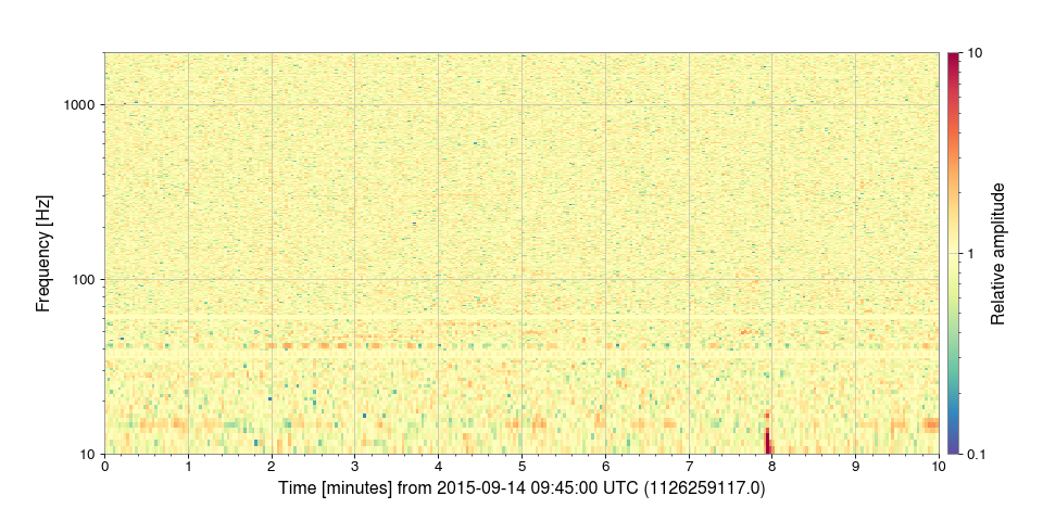
Even with a normalised spectrogram, the resolution is such that a signal as short as that of GW150914 is impossible to see. The next example uses a high-resolution spectrogram method to zoom in around the exact time of the signal.