1. Plotting a Spectrogram
One of the most useful methods of visualising gravitational-wave data is to use a spectrogram, highlighting the frequency-domain content of some data over a number of time steps.
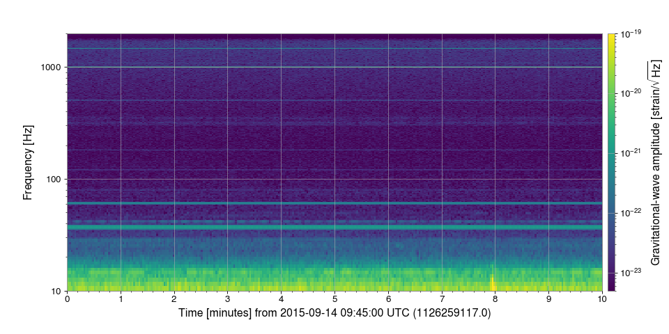
For this example we can use the public data around the GW150914 detection.
First, we import the TimeSeries and call
TimeSeries.fetch_open_data() the download the strain
data for the LIGO-Hanford interferometer
from gwpy.timeseries import TimeSeries
data = TimeSeries.fetch_open_data(
    'H1', 'Sep 14 2015 09:45', 'Sep 14 2015 09:55')
Next, we can calculate a Spectrogram using the
spectrogram() method of the TimeSeries over a 2-second stride
with a 1-second FFT and # .5-second overlap (50%):
specgram = data.spectrogram(2, fftlength=1, overlap=.5) ** (1/2.)
Note
TimeSeries.spectrogram() returns a Power Spectral Density (PSD)
Spectrogram by default, so we use the ** (1/2.)
to convert this into a (more familiar) Amplitude Spectral Density.
Finally, we can make a plot using the
plot() method
plot = specgram.imshow(norm='log', vmin=5e-24, vmax=1e-19)
ax = plot.gca()
ax.set_yscale('log')
ax.set_ylim(10, 2000)
ax.colorbar(
    label=r'Gravitational-wave amplitude [strain/$\sqrt{\mathrm{Hz}}$]')
plot.show()
(png)

This shows the relative stability of the interferometer sensitivity over
the ten-minute span. Despite there being a gravitational-wave signal in the
data, the resolution (and dynamic range) of the spectrogram make it
impossible to see. The next example
shows you how to normalise a Spectrogram to better
see features in the most sensitive frequency band.