Plotting time-domain data
Plotting one TimeSeries
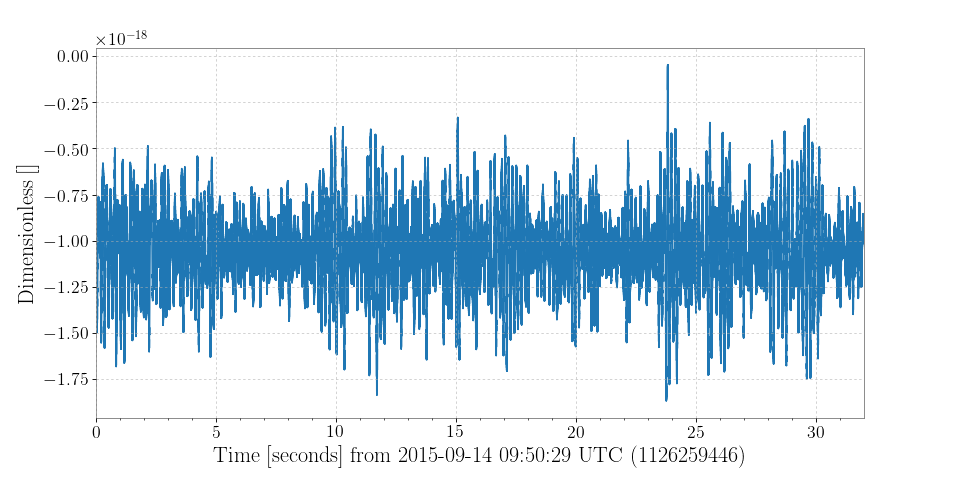
The TimeSeries class includes a plot() method to trivialise visualisation of the contained data.
Reproducing the example from Remote data access:
>>> l1hoft = TimeSeries.fetch_open_data('L1', 'Sep 14 2015 09:50:29', 'Sep 14 2015 09:51:01')
>>> plot = l1hoft.plot()
>>> plot.show()
(png)

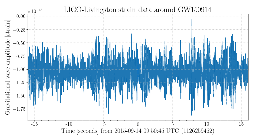
The returned object plot is a TimeSeriesPlot, a sub-class of matplotlib.figure.Figure adapted for GPS time-stamped data.
Customisations of the figure or the underlying TimeSeriesAxes can be done using standard matplotlib methods.
For example:
>>> ax = plot.gca()
>>> ax.set_ylabel('Gravitational-wave amplitude [strain]')
>>> ax.set_epoch(1126259462)
>>> ax.set_title('LIGO-Livingston strain data around GW150914')
>>> ax.axvline(1126259462, color='orange', linestyle='--')
>>> plot.refresh()
(png)

Here the set_epoch() method is used to reset the reference time for the x-axis.
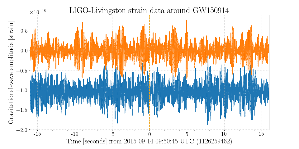
Plotting multiple TimeSeries together
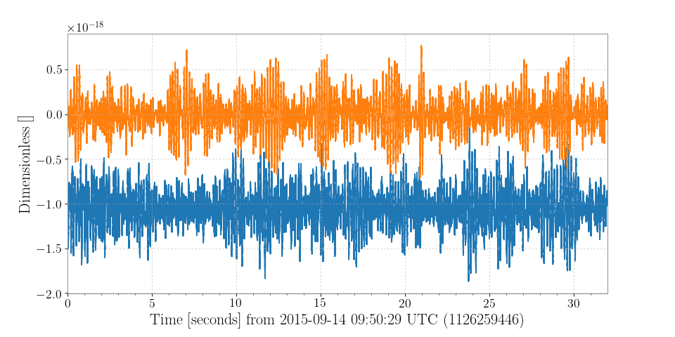
Multiple TimeSeries classes can be combined on a figure in a number of different ways, the most obvious is to plot() the first, then add the second on the same axes.
Reusing the same plot from above:
>>> h1hoft = TimeSeries.fetch_open_data('H1', 'Sep 14 2015 09:50:29', 'Sep 14 2015 09:51:01')
>>> ax = plot.gca()
>>> ax.plot(h1hoft)
>>> plot.refresh()
(png)
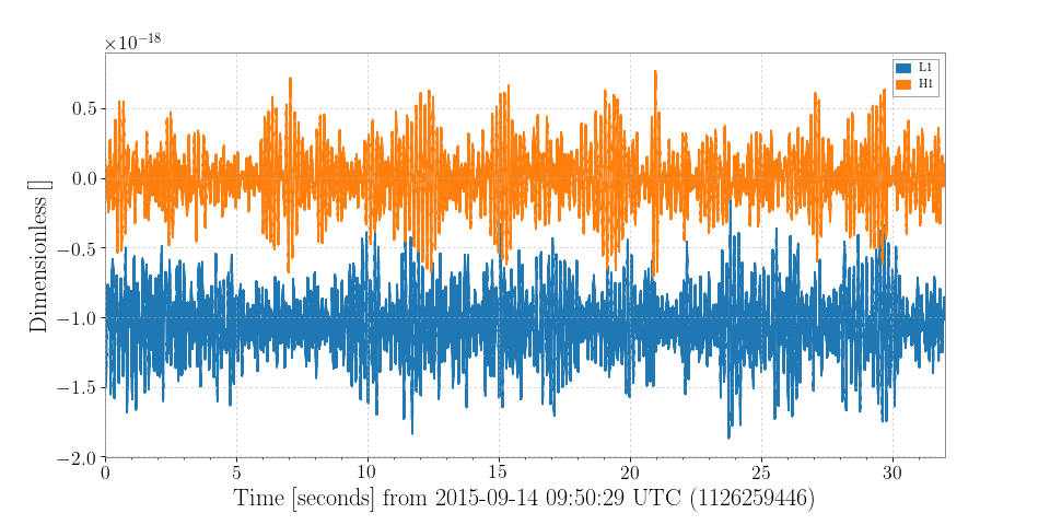
Alternatively, the two TimeSeries could be combined into a TimeSeriesDict to use the plot() method from that class:
>>> combined = TimeSeriesDict()
>>> combined['L1'] = l1hoft
>>> combined['H1'] = h1hoft
>>> plot = combined.plot()
>>> plot.gca().legend()
>>> plot.show()
(png)
The third method of achieving the same result is by importing and accessing the TimeSeriesPlot object directly:
>>> from gwpy.plotter import TimeSeriesPlot
>>> plot = TimeSeriesPlot(l1hoft, h1hoft)
>>> plot.show()
(png)

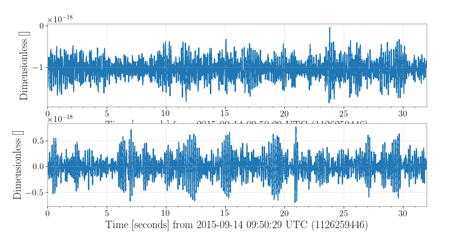
Using the TimeSeriesPlot directly allows for greater customisation.
The sep=True keyword argument can be used to plot each TimeSeries on its own axes:
>>> plot = TimeSeriesPlot(l1hoft, h1hoft, sep=True)
>>> plot.show()
(png)

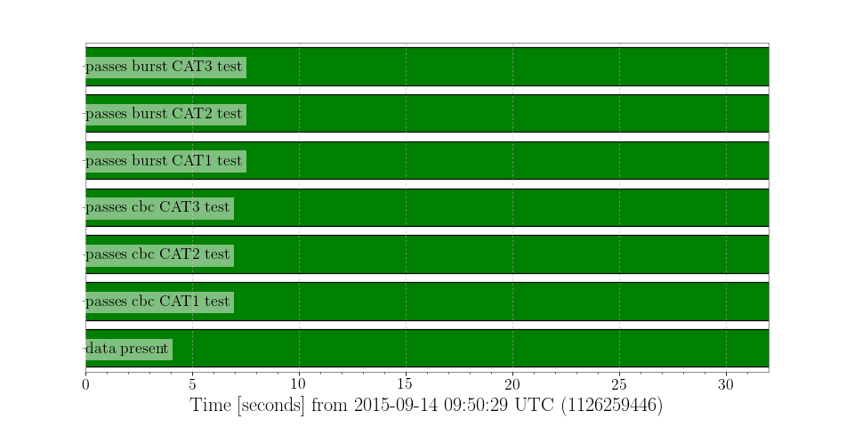
Plotting a StateVector
A StateVector can be trivially plotted in two ways, specified by the format keyword argument of the plot() method:
| Format | Description |
|---|---|
'segments' |
A bit-wise representation of each bit in the vector (default) |
'timeseries' |
A standard time-series representation |
>>> h1state = StateVector.fetch_open_data('H1', 'Sep 14 2015 09:50:29', 'Sep 14 2015 09:51:01')
>>> plot = h1state.plot(insetlabels=True)
>>> plot.show()
(png)

For a format='segments' display the bits attribute of the StateVector is used to identify and label each of the binary bits in the vector.
Also, the insetlabels=True keyword was given to display the bit labels inside the axes (otherwise they would be cut off the side of the figure).
That each of the segment bars is green for the full 32-second duration indicates that each of the statements (e.g. ‘passes cbc CAT1 test’) is true throughout this time interval.