Plotting API
This document provides a reference for the following Figure class objects:
Plot |
An extension of the core matplotlib Figure |
TimeSeriesPlot |
Figure for displaying a TimeSeries. |
FrequencySeriesPlot |
Figure for displaying a FrequencySeries |
SpectrogramPlot |
Figure for displaying a Spectrogram. |
SegmentPlot |
Plot for displaying a DataQualityFlag |
EventTablePlot |
Figure for displaying a EventTable |
BodePlot |
A Plot class for visualising transfer functions |
and the following Axes class objects:
Axes |
An extension of the core matplotlib Axes. |
TimeSeriesAxes |
Custom Axes for a TimeSeriesPlot. |
FrequencySeriesAxes |
Custom Axes for a FrequencySeriesPlot. |
SegmentAxes |
Custom Axes for a SegmentPlot. |
EventTableAxes |
Custom Axes for an ~gwpy.plotter.EventTablePlot`. |
Figure objects
Each of the below classes represents a figure object; for brevity inherited methods and attributes are not documented here, please follow links to the parent classes for documentation of available methods and attributes.
-
class
gwpy.plotter.Plot(*args, **kwargs)[source]¶ Bases:
matplotlib.figure.FigureAn extension of the core matplotlib
FigureThe
Plotprovides a number of methods to simplify generating figures from GWpy data objects, and modifying them on-the-fly in interactive mode.-
add_array(artist, *args, **kwargs)[source]¶ Add a
Arrayto this plotParameters: array :
Arraythe
Arrayto displayprojection :
strname of the Axes projection on which to plot
ax :
Axesnewax :
bool, optionalforce data to plot on a fresh set of
Axes**kwargs
other keyword arguments for the
Plot.add_linefunctionReturns: artist :
Artistthe layer return from the relevant plotting function
-
add_colorbar(artist, *args, **kwargs)[source]¶ Add a colorbar to the current
PlotA colorbar must be associated with an
Axeson thisPlot, and an existing mappable element (e.g. an image) (ifvisible=True).Parameters: mappable : matplotlib data collection
collection against which to map the colouring
ax :
Axesaxes from which to steal space for the colorbar
location :
str, optionalposition of the colorbar
width :
float, optionalwidth of the colorbar as a fraction of the axes
pad :
float, optionalgap between the axes and the colorbar as a fraction of the axes
log :
bool, optionaldisplay the colorbar with a logarithmic scale, or not
label :
str, optionallabel for the colorbar
clim : pair of
float(lower, upper) limits for the colorbar scale, values outside of these limits will be clipped to the edges
visible :
bool, optionalmake the colobar visible on the figure, this is useful to make two plots, each with and without a colorbar, but guarantee that the axes will be the same size
**kwargs
other keyword arguments to be passed to the
colorbar()generatorReturns: cbar :
Colorbarthe newly added
ColorbarExamples
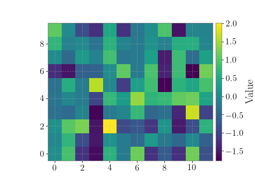
>>> import numpy
>>> from gwpy.plotter import Plot
To plot a simple image and add a colorbar:
>>> plot = Plot()
>>> ax = plot.gca()
>>> ax.imshow(numpy.random.randn(120).reshape((10, 12)))
>>> plot.add_colorbar(label='Value')
>>> plot.show()
(png)

-
add_dataqualityflag(flag, projection=None, ax=None, newax=False, sharex=None, sharey=None, **kwargs)[source]¶ Add a
DataQualityFlagto this plotParameters: flag :
DataQualityFlagthe
DataQualityFlagto displayprojection :
strname of the Axes projection on which to plot
ax :
Axesnewax :
bool, optionalforce data to plot on a fresh set of
Axes**kwargs
other keyword arguments for the
Plot.add_linefunctionReturns: collection :
Collectionthe newly added patch collection
-
add_frequencyseries(artist, *args, **kwargs)[source]¶ Add a
FrequencySeriestrace to this plotParameters: spectrum :
FrequencySeriesthe
FrequencySeriesto displayax :
Axesnewax :
bool, optionalforce data to plot on a fresh set of
Axes**kwargs
other keyword arguments for the
Plot.add_linefunctionReturns: line :
Line2Dthe newly added line
-
add_image(artist, *args, **kwargs)[source]¶ Add a 2-D image to this plot
Parameters: image :
numpy.ndarray2-D array of data for the image
**kwargs
other keyword arguments are passed to the
matplotlib.axes.Axes.imshow()functionReturns: image :
AxesImagethe newly added image
-
add_legend(artist, *args, **kwargs)[source]¶ Add a legend to this
Ploton the most favourableAxesAll non-keyword
argsandkwargsare passed directly to thelegend()generatorReturns: legend :
Legendthe new legend
-
add_line(artist, *args, **kwargs)[source]¶ Add a line to the current plot
Parameters: x : array-like
x positions of the line points (in axis coordinates)
y : array-like
y positions of the line points (in axis coordinates)
projection :
str, optionalname of the Axes projection on which to plot
ax :
Axesnewax :
bool, optionalforce data to plot on a fresh set of
Axes**kwargs
additional keyword arguments passed directly on to the axes
plot()method.Returns: line :
Line2Dthe newly added line
-
add_scatter(artist, *args, **kwargs)[source]¶ Add a set or points to the current plot
Parameters: x : array-like
x-axis data points
y : array-like
y-axis data points
projection :
str, optionalname of the Axes projection on which to plot
ax :
Axesnewax :
bool, optionalforce data to plot on a fresh set of
Axes**kwargs.
other keyword arguments passed to the
matplotlib.axes.Axes.scatter()functionReturns: collection :
Collectionthe
Collectionfor this new scatter
-
add_spectrogram(artist, *args, **kwargs)[source]¶ Add a
Spectrogramto this plotParameters: spectrogram :
Spectrogramthe
Spectrogramto displayax :
Axesnewax :
bool, optionalforce data to plot on a fresh set of
Axes**kwargs
other keyword arguments for the
Plot.add_linefunctionReturns: qm :
QuadMeshthe new
QuadMeshlayer representing the spectrogram display
-
add_subplot(*args, **kwargs)[source]¶ Add a subplot. Examples:
fig.add_subplot(111)

# equivalent but more general
fig.add_subplot(1,1,1)

# add subplot with red background
fig.add_subplot(212, facecolor='r')

# add a polar subplot
fig.add_subplot(111, projection='polar')

# add Subplot instance sub
fig.add_subplot(sub)
kwargs are legal
Axeskwargs plus projection, which chooses a projection type for the axes. (For backward compatibility, polar=True may also be provided, which is equivalent to projection=’polar’). Valid values for projection are: [u’aitoff’, u’hammer’, u’lambert’, u’mollweide’, u’polar’, u’rectilinear’]. Some of these projections support additional kwargs, which may be provided toadd_axes().The
Axesinstance will be returned.If the figure already has a subplot with key (args, kwargs) then it will simply make that subplot current and return it.
See also
subplot()for an explanation of the args.The following kwargs are supported:
adjustable: [ ‘box’ | ‘datalim’ | ‘box-forced’] agg_filter: unknown alpha: float (0.0 transparent through 1.0 opaque) anchor: unknown animated: [True | False] aspect: unknown autoscale_on: unknown autoscalex_on: unknown autoscaley_on: unknown axes: anAxesinstance axes_locator: unknown axisbelow: [ True | False | ‘line’ ] clip_box: amatplotlib.transforms.Bboxinstance clip_on: [True | False] clip_path: [ (Path,Transform) |Patch| None ] color_cycle: unknown contains: a callable function facecolor: unknown fc: unknown figure: unknown frame_on: [ True | False ] gid: an id string label: string or anything printable with ‘%s’ conversion. navigate: [ True | False ] navigate_mode: unknown path_effects: unknown picker: [None|float|boolean|callable] position: unknown rasterization_zorder: unknown rasterized: [True | False | None] sketch_params: unknown snap: unknown title: unknown transform:Transforminstance url: a url string visible: [True | False] xbound: unknown xlabel: unknown xlim: unknown xmargin: unknown xscale: [u’linear’ | u’log’ | u’logit’ | u’symlog’] xticklabels: sequence of strings xticks: sequence of floats ybound: unknown ylabel: unknown ylim: unknown ymargin: unknown yscale: [u’linear’ | u’log’ | u’logit’ | u’symlog’] yticklabels: sequence of strings yticks: sequence of floats zorder: any number
-
add_timeseries(artist, *args, **kwargs)[source]¶ Add a
TimeSeriestrace to this plotParameters: timeseries :
TimeSeriesthe TimeSeries to display
ax :
Axesnewax :
bool, optionalforce data to plot on a fresh set of
Axes**kwargs
other keyword arguments for the
Plot.add_arrayfunctionReturns: line :
Line2Dthe newly added line object
-
get_axes(projection=None)[source]¶ Find all
Axes, optionally matching the given projectionParameters: projection :
strname of axes types to return
Returns:
-
get_title(figure, *args, **kwargs)[source]¶ Get an axes title.
Get one of the three available axes titles. The available titles are positioned above the axes in the center, flush with the left edge, and flush with the right edge.
Parameters: loc : {‘center’, ‘left’, ‘right’}, str, optional
Which title to get, defaults to ‘center’
Returns: title: str
The title text string.
-
get_xlim(figure, *args, **kwargs)[source]¶ Get the x-axis range
Returns: xlimits : tuple
Returns the current x-axis limits as the tuple (
left,right).Notes
The x-axis may be inverted, in which case the
leftvalue will be greater than therightvalue.
-
get_xscale(figure, *args, **kwargs)[source]¶ Return the xaxis scale string: linear, log, logit, symlog
-
get_ylim(figure, *args, **kwargs)[source]¶ Get the y-axis range
Returns: ylimits : tuple
Returns the current y-axis limits as the tuple (
bottom,top).Notes
The y-axis may be inverted, in which case the
bottomvalue will be greater than thetopvalue.
-
get_yscale(figure, *args, **kwargs)[source]¶ Return the yaxis scale string: linear, log, logit, symlog
-
html_map(figure, *args, **kwargs)[source]¶ Create an HTML map for some data contained in these
AxesParameters: data :
Artist,Series,array-likedata to map, one of an
Artistalready drawn on these axes ( viaplot()orscatter(), for example) or a data setimagefile :
strpath to image file on disk for the containing
Figuremapname :
str, optionalID to connect <img> tag and <map> tags, default:
'points'. This should be unique if multiple maps are to be written to a single HTML file.shape :
str, optionalshape for <area> tag, default:
'circle'standalone :
bool, optionalwrap map HTML with required HTML5 header and footer tags, default:
Truetitle :
str, optionaltitle name for standalone HTML page
jquery :
str, optionalURL of jquery script, defaults to googleapis.com URL
Returns: HTML :
strstring of HTML markup that defines the <img> and <map>
-
logx¶ View x-axis in logarithmic scale
-
logy¶ View y-axis in logarithmic scale
-
save(*args, **kwargs)[source]¶ Save the figure to disk.
This method is an alias to
savefig(), all arguments are passed directory to that method.
-
set_auto_refresh(refresh)[source]¶ Set the auto-refresh setting for this
Plot.With auto_refresh set to
True, all modifications of the underlyingAxeswill trigger the plot to be re-drawnParameters:
-
set_title(artist, *args, **kwargs)[source]¶ Set a title for the axes.
Set one of the three available axes titles. The available titles are positioned above the axes in the center, flush with the left edge, and flush with the right edge.
Parameters: label : str
Text to use for the title
fontdict : dict
A dictionary controlling the appearance of the title text, the default
fontdictis:{'fontsize': rcParams['axes.titlesize'], 'fontweight' : rcParams['axes.titleweight'], 'verticalalignment': 'baseline', 'horizontalalignment': loc}
loc : {‘center’, ‘left’, ‘right’}, str, optional
Which title to set, defaults to ‘center’
Returns: text :
TextThe matplotlib text instance representing the title
Other Parameters: kwargs : text properties
Other keyword arguments are text properties, see
Textfor a list of valid text properties.
-
set_xlabel(figure, *args, **kwargs)[source]¶ Set the label for the xaxis.
Parameters: xlabel : string
x label
labelpad : scalar, optional, default: None
spacing in points between the label and the x-axis
Other Parameters: - kwargs :
Textproperties
See also
text- for information on how override and the optional args work
- kwargs :
-
set_xlim(artist, *args, **kwargs)[source]¶ Set the data limits for the x-axis
Parameters: left : scalar, optional
The left xlim (default: None, which leaves the left limit unchanged).
right : scalar, optional
The right xlim (default: None, which leaves the right limit unchanged).
emit : bool, optional
Whether to notify observers of limit change (default: True).
auto : bool or None, optional
Whether to turn on autoscaling of the x-axis. True turns on, False turns off (default action), None leaves unchanged.
xlimits : tuple, optional
The left and right xlims may be passed as the tuple (
left,right) as the first positional argument (or as theleftkeyword argument).Returns: xlimits : tuple
Returns the new x-axis limits as (
left,right).Notes
The
leftvalue may be greater than therightvalue, in which case the x-axis values will decrease from left to right.Examples
>>> set_xlim(left, right)
>>> set_xlim((left, right))
>>> left, right = set_xlim(left, right)
One limit may be left unchanged.
>>> set_xlim(right=right_lim)
Limits may be passed in reverse order to flip the direction of the x-axis. For example, suppose
xrepresents the number of years before present. The x-axis limits might be set like the following so 5000 years ago is on the left of the plot and the present is on the right.>>> set_xlim(5000, 0)
-
set_xscale(artist, *args, **kwargs)[source]¶ Set the x-axis scale
Set the scaling of the x-axis: u’linear’ | u’log’ | u’logit’ | u’symlog’
ACCEPTS: [u’linear’ | u’log’ | u’logit’ | u’symlog’]
- Different kwargs are accepted, depending on the scale:
‘linear’
‘log’
- basex/basey:
- The base of the logarithm
- nonposx/nonposy: [‘mask’ | ‘clip’ ]
- non-positive values in x or y can be masked as invalid, or clipped to a very small positive number
- subsx/subsy:
Where to place the subticks between each major tick. Should be a sequence of integers. For example, in a log10 scale:
[2, 3, 4, 5, 6, 7, 8, 9]will place 8 logarithmically spaced minor ticks between each major tick.
‘logit’
- nonpos: [‘mask’ | ‘clip’ ]
- values beyond ]0, 1[ can be masked as invalid, or clipped to a number very close to 0 or 1
‘symlog’
- basex/basey:
- The base of the logarithm
- linthreshx/linthreshy:
- The range (-x, x) within which the plot is linear (to avoid having the plot go to infinity around zero).
- subsx/subsy:
Where to place the subticks between each major tick. Should be a sequence of integers. For example, in a log10 scale:
[2, 3, 4, 5, 6, 7, 8, 9]will place 8 logarithmically spaced minor ticks between each major tick.
- linscalex/linscaley:
- This allows the linear range (-linthresh to linthresh) to be stretched relative to the logarithmic range. Its value is the number of decades to use for each half of the linear range. For example, when linscale == 1.0 (the default), the space used for the positive and negative halves of the linear range will be equal to one decade in the logarithmic range.
-
set_ylabel(artist, *args, **kwargs)[source]¶ Set the label for the yaxis
Parameters: ylabel : string
y label
labelpad : scalar, optional, default: None
spacing in points between the label and the x-axis
Other Parameters: - kwargs :
Textproperties
See also
text- for information on how override and the optional args work
- kwargs :
-
set_ylim(artist, *args, **kwargs)[source]¶ Set the data limits for the y-axis
Parameters: bottom : scalar, optional
The bottom ylim (default: None, which leaves the bottom limit unchanged).
top : scalar, optional
The top ylim (default: None, which leaves the top limit unchanged).
emit : bool, optional
Whether to notify observers of limit change (default: True).
auto : bool or None, optional
Whether to turn on autoscaling of the y-axis. True turns on, False turns off (default action), None leaves unchanged.
ylimits : tuple, optional
The bottom and top yxlims may be passed as the tuple (
bottom,top) as the first positional argument (or as thebottomkeyword argument).Returns: ylimits : tuple
Returns the new y-axis limits as (
bottom,top).Notes
The
bottomvalue may be greater than thetopvalue, in which case the y-axis values will decrease from bottom to top.Examples
>>> set_ylim(bottom, top)
>>> set_ylim((bottom, top))
>>> bottom, top = set_ylim(bottom, top)
One limit may be left unchanged.
>>> set_ylim(top=top_lim)
Limits may be passed in reverse order to flip the direction of the y-axis. For example, suppose
yrepresents depth of the ocean in m. The y-axis limits might be set like the following so 5000 m depth is at the bottom of the plot and the surface, 0 m, is at the top.>>> set_ylim(5000, 0)
-
set_yscale(artist, *args, **kwargs)[source]¶ Set the y-axis scale
Set the scaling of the y-axis: u’linear’ | u’log’ | u’logit’ | u’symlog’
ACCEPTS: [u’linear’ | u’log’ | u’logit’ | u’symlog’]
- Different kwargs are accepted, depending on the scale:
- ‘linear’
‘log’
- basex/basey:
- The base of the logarithm
- nonposx/nonposy: [‘mask’ | ‘clip’ ]
- non-positive values in x or y can be masked as invalid, or clipped to a very small positive number
- subsx/subsy:
Where to place the subticks between each major tick. Should be a sequence of integers. For example, in a log10 scale:
[2, 3, 4, 5, 6, 7, 8, 9]will place 8 logarithmically spaced minor ticks between each major tick.
‘logit’
- nonpos: [‘mask’ | ‘clip’ ]
- values beyond ]0, 1[ can be masked as invalid, or clipped to a number very close to 0 or 1
‘symlog’
- basex/basey:
- The base of the logarithm
- linthreshx/linthreshy:
- The range (-x, x) within which the plot is linear (to avoid having the plot go to infinity around zero).
- subsx/subsy:
Where to place the subticks between each major tick. Should be a sequence of integers. For example, in a log10 scale:
[2, 3, 4, 5, 6, 7, 8, 9]will place 8 logarithmically spaced minor ticks between each major tick.
- linscalex/linscaley:
- This allows the linear range (-linthresh to linthresh) to be stretched relative to the logarithmic range. Its value is the number of decades to use for each half of the linear range. For example, when linscale == 1.0 (the default), the space used for the positive and negative halves of the linear range will be equal to one decade in the logarithmic range.
-
show(block=None, warn=True)[source]¶ Display the current figure (if possible)
Parameters: open the figure and block until the figure is closed, otherwise open the figure as a detached window. If
block=None, GWpy will block if using an interactive backend and not in an ipython session.if
block=Falseis given, print a warning if matplotlib is not running in an interactive backend and cannot display the figure.Notes
If blocking is employed, this method calls the
pyplot.showfunction, otherwise theshow()method of thisFigureis used.
-
title¶ title for the current axes
-
xlabel¶ x-axis label for the current axes
-
xlim¶ x-axis limits for the current axes
-
ylabel¶ y-axis label for the current axes
-
ylim¶ y-axis limits for the current axes
-
-
class
gwpy.plotter.TimeSeriesPlot(*series, **kwargs)[source]¶ Bases:
gwpy.plotter.series.SeriesPlotFigurefor displaying aTimeSeries.Parameters: *series :
TimeSeriesany number of
TimeSeriesto display on the plot**kwargs
other keyword arguments as applicable for the
Plot-
add_state_segments(segments, ax=None, height=0.2, pad=0.1, location='bottom', plotargs={})[source]¶ Add a
SegmentListto thisTimeSeriesPlotindicating state information about the main Axes data.By default, segments are displayed in a thin horizontal set of Axes sitting immediately below the x-axis of the main
Parameters: segments :
DataQualityFlagA data-quality flag, or
SegmentListdenoting state segments about this Plotax :
Axesspecific Axes set against which to anchor new segment Axes
plotargs
keyword arguments passed to
plot()
-
epoch¶ The GPS epoch of this plot
-
-
class
gwpy.plotter.FrequencySeriesPlot(*series, **kwargs)[source]¶ Bases:
gwpy.plotter.series.SeriesPlotFigurefor displaying aFrequencySeries
-
class
gwpy.plotter.SpectrogramPlot(*args, **kwargs)[source]¶ Bases:
gwpy.plotter.timeseries.TimeSeriesPlotFigurefor displaying aSpectrogram.
-
class
gwpy.plotter.SegmentPlot(*flags, **kwargs)[source]¶ Bases:
gwpy.plotter.timeseries.TimeSeriesPlotPlotfor displaying aDataQualityFlagParameters: *flags :
DataQualityFlagany number of
DataQualityFlagto display on the plotinsetlabels :
bool, default:Falsedisplay segment labels inside the axes. Prevents very long segment names from getting squeezed off the end of a standard figure
**kwargs
other keyword arguments as applicable for the
Plot-
add_bitmask(mask, ax=None, width=0.2, pad=0.1, visible=True, axes_class=<class 'gwpy.plotter.segments.SegmentAxes'>, topdown=False, **plotargs)[source]¶ Display a state-word bitmask on a new set of Axes.
-
add_dataqualityflag(flag, **kwargs)[source]¶ Add a
DataQualityFlagto this plotParameters: flag :
DataQualityFlagthe
DataQualityFlagto displayprojection :
strname of the Axes projection on which to plot
ax :
Axesnewax :
bool, optionalforce data to plot on a fresh set of
Axes**kwargs
other keyword arguments for the
Plot.add_linefunctionReturns: collection :
Collectionthe newly added patch collection
-
-
class
gwpy.plotter.EventTablePlot(*args, **kwargs)[source]¶ Bases:
gwpy.plotter.timeseries.TimeSeriesPlotFigurefor displaying aEventTableParameters: table :
EventTableTableto displayx :
strname of column to display on the X-axis
y :
strname of column to display on the Y-axis
c :
str, optionalname of column by which to colour the data
**kwargs
any other arguments applicable to the
Plotconstructor, and theTableplotter.Returns: plot :
EventTablePlotnew plot for displaying tabular data.
Notes
The form of the returned
EventTablePlotis decided at run-time, rather than when the module was imported. If tables are passed directly to the constructor, for example:>>> plot = EventTablePlot(table1, 'time', 'snr')
the columns as given are used to determine the appropriate parent class for the output.
If the input x-column (the first string argument) ends with ‘time’ the output is a child of the
TimeSeriesPlot, allowing easy formatting of GPS times, while if the x-column ends with ‘frequency’, the output comes from theFrequencySeriesPlot, otherwise the parent is the corePlot.-
add_table(table, x, y, color=None, projection='triggers', ax=None, newax=None, **kwargs)[source]¶ Add a
Tableto this PlotParameters: table :
Table,EventTableTableto displayx :
strname of column to display on the X-axis
y :
strname of column to display on the Y-axis
c :
str, optionalname of column by which to colour the data
projection :
str, optiona, default:'triggers'name of the Axes projection on which to plot data
ax :
Axes, optionalnewax :
bool, optional, default:Falseforce data to plot on a fresh set of
Axes**kwargs.
other keyword arguments passed to the
EventTableAxes.plot_table()methodReturns: scatter :
Collectionthe displayed collection for this
TableSee also
EventTableAxes.plot_table()- for details on arguments and keyword arguments other than
axandnewaxfor this method.
-
add_tiles(table, x, y, width, height, color=None, anchor='center', projection='triggers', ax=None, newax=None, **kwargs)[source]¶ Add a
Tableto this PlotParameters: table :
Table,EventTableTableto displayx :
strname of column for tile x-anchor
y :
strname of column for tile y-anchor
width :
strname of column for tile width
height :
strname of column for tile height
color :
str, optionalname of column by which to colour the data
anchor :
str, optional, default:'center'position of (x, y) vertex on tile, default ‘center’. Other options: ‘ll’, ‘lr’, ‘ul’, ‘ur’.
projection :
str, optiona, default:'triggers'name of the Axes projection on which to plot data
ax :
Axes, optionalnewax :
bool, optional, default:Falseforce data to plot on a fresh set of
Axes**kwargs.
other keyword arguments passed to the
EventTableAxes.plot_table()methodReturns: scatter :
Collectionthe displayed collection for this
TableSee also
EventTableAxes.plot_table()- for details on arguments and keyword arguments other than
axandnewaxfor this method.
-
-
class
gwpy.plotter.BodePlot(*filters, **kwargs)[source]¶ Bases:
gwpy.plotter.core.PlotA
Plotclass for visualising transfer functionsParameters: *filters :
lti,FrequencySeriesfrequencies :
numpy.ndarray, optionallist of frequencies (in Hertz) at which to plot
db :
bool, optional, default:Trueif
True, display magnitude in decibels, otherwise display amplitude.**kwargs
Returns: plot :
BodePlot-
add_filter(filter_, frequencies=None, dB=True, analog=False, sample_rate=None, **kwargs)[source]¶ Add a linear time-invariant filter to this BodePlot
Parameters: frequencies :
numpy.ndarray, optionallist of frequencies (in Hertz) at which to plot
dB :
bool, optional**kwargs
any other keyword arguments accepted by
plot()Returns: the lines drawn for the magnitude and phase of the filter.
-
add_frequencyseries(spectrum, dB=True, power=False, **kwargs)[source]¶ Plot the magnitude and phase of a complex-valued
FrequencySeriesParameters: spectrum :
FrequencySeriesthe (complex-valued)
FrequencySeriesto displaydb :
bool, optional, default:Trueif
True, display magnitude in decibels, otherwise display amplitude.power :
bool, optional, default:Falsegive
Trueto incidate thatspectrumholds power values, sodB = 10 * log(abs(spectrum)), otherwisedb = 20 * log(abs(spectrum)). This argument is ignored ifdb=False.**kwargs
any other keyword arguments accepted by
plot()Returns: the lines drawn for the magnitude and phase of the filter.
-
maxes¶ FrequencySeriesAxesfor the Bode magnitude
-
paxes¶ FrequencySeriesAxesfor the Bode phase
-
Axes objects
Each of the below classes represents a set of axes on which data are displayed; for brevity inherited methods and attributes are not documented here, please follow links to the parent classes for documentation of available methods and attributes.
-
class
gwpy.plotter.Axes(fig, rect, facecolor=None, frameon=True, sharex=None, sharey=None, label=u'', xscale=None, yscale=None, axisbg=None, **kwargs)[source]¶ Bases:
matplotlib.axes._axes.AxesAn extension of the core matplotlib
Axes.These custom
Axesprovide only some simpler attribute accessors.Notes
A new set of
Axesshould be constructed via:>>> plot.add_subplots(111, projection='xxx')
where
plotis aPlot, and'xxx'is the name of theAxesyou want to add.-
html_map(imagefile, data=None, **kwargs)[source]¶ Create an HTML map for some data contained in these
AxesParameters: data :
Artist,Series,array-likedata to map, one of an
Artistalready drawn on these axes ( viaplot()orscatter(), for example) or a data setimagefile :
strpath to image file on disk for the containing
Figuremapname :
str, optionalID to connect <img> tag and <map> tags, default:
'points'. This should be unique if multiple maps are to be written to a single HTML file.shape :
str, optionalshape for <area> tag, default:
'circle'standalone :
bool, optionalwrap map HTML with required HTML5 header and footer tags, default:
Truetitle :
str, optionaltitle name for standalone HTML page
jquery :
str, optionalURL of jquery script, defaults to googleapis.com URL
Returns: HTML :
strstring of HTML markup that defines the <img> and <map>
-
resize(artist, *args, **kwargs)[source]¶ Set the axes position with:
>>> pos = [left, bottom, width, height]
in relative 0,1 coords, or pos can be a
BboxThere are two position variables: one which is ultimately used, but which may be modified by
apply_aspect(), and a second which is the starting point forapply_aspect().
-
-
class
gwpy.plotter.TimeSeriesAxes(*args, **kwargs)[source]¶ Bases:
gwpy.plotter.series.SeriesAxesCustom
Axesfor aTimeSeriesPlot.-
auto_gps_scale()[source]¶ Automagically set the GPS scale for the time-axis of this plot based on the current view limits
-
draw(artist, renderer, *args, **kwargs)¶ Draw everything (plot lines, axes, labels)
-
epoch¶ Return the current GPS epoch (t=0)
-
plot(artist, *args, **kwargs)[source]¶ Plot data onto these Axes.
Parameters: args
a single
TimeSeries(or sub-class) or standard (x, y) data arrayskwargs
keyword arguments applicable to
plot()Returns: Line2D
the
Line2Dfor this line layerSee also
matplotlib.axes.Axes.plot- for a full description of acceptable
*argsand**kwargs
-
plot_array2d(spectrogram, **kwargs)[source]¶ Plot a 2D array onto these axes
Parameters: array :
Array2D,Data to plot (e.g. a
Spectrogram)imshow :
bool, optionalIf
True, useimshow()to render the array as an image, otherwise usepcolormesh(), default isTruewithmatplotlib >= 2.0, otherwiseFalse.norm :
'log',NormalizeA
Normalize`instance used to scale the colour data, or'log'to useLogNorm.**kwargs
Any other keyword arguments acceptable for
imshow()(ifimshow=True), orpcolormesh()(imshow=False)Returns: layer :
QuadMesh,Imagethe layer for this array
See also
matplotlib.axes.Axes.pcolormesh- for a full description of acceptable
*argsand**kwargs
-
plot_series(artist, *args, **kwargs)[source]¶ Plot a
Seriesonto these axesParameters: series :
Seriesdata to plot
**kwargs
any other keyword arguments acceptable for
plot()Returns: line :
Line2Dthe newly added line
See also
matplotlib.axes.Axes.plot- for a full description of acceptable
*argsand**kwargs
-
plot_spectrogram(spectrogram, **kwargs)[source]¶ Plot a 2D array onto these axes
Parameters: array :
Array2D,Data to plot (e.g. a
Spectrogram)imshow :
bool, optionalIf
True, useimshow()to render the array as an image, otherwise usepcolormesh(), default isTruewithmatplotlib >= 2.0, otherwiseFalse.norm :
'log',NormalizeA
Normalize`instance used to scale the colour data, or'log'to useLogNorm.**kwargs
Any other keyword arguments acceptable for
imshow()(ifimshow=True), orpcolormesh()(imshow=False)Returns: layer :
QuadMesh,Imagethe layer for this array
See also
matplotlib.axes.Axes.pcolormesh- for a full description of acceptable
*argsand**kwargs
-
plot_timeseries(artist, *args, **kwargs)[source]¶ Plot a
Seriesonto these axesParameters: series :
Seriesdata to plot
**kwargs
any other keyword arguments acceptable for
plot()Returns: line :
Line2Dthe newly added line
See also
matplotlib.axes.Axes.plot- for a full description of acceptable
*argsand**kwargs
-
set_xlim(left=None, right=None, emit=True, auto=False, **kw)[source]¶ Set the data limits for the x-axis
Parameters: left : scalar, optional
The left xlim (default: None, which leaves the left limit unchanged).
right : scalar, optional
The right xlim (default: None, which leaves the right limit unchanged).
emit : bool, optional
Whether to notify observers of limit change (default: True).
auto : bool or None, optional
Whether to turn on autoscaling of the x-axis. True turns on, False turns off (default action), None leaves unchanged.
xlimits : tuple, optional
The left and right xlims may be passed as the tuple (
left,right) as the first positional argument (or as theleftkeyword argument).Returns: xlimits : tuple
Returns the new x-axis limits as (
left,right).Notes
The
leftvalue may be greater than therightvalue, in which case the x-axis values will decrease from left to right.Examples
>>> set_xlim(left, right)
>>> set_xlim((left, right))
>>> left, right = set_xlim(left, right)
One limit may be left unchanged.
>>> set_xlim(right=right_lim)
Limits may be passed in reverse order to flip the direction of the x-axis. For example, suppose
xrepresents the number of years before present. The x-axis limits might be set like the following so 5000 years ago is on the left of the plot and the present is on the right.>>> set_xlim(5000, 0)
-
set_xscale(scale, *args, **kwargs)[source]¶ Set the x-axis scale
Set the scaling of the x-axis: u’linear’ | u’log’ | u’logit’ | u’symlog’
ACCEPTS: [u’linear’ | u’log’ | u’logit’ | u’symlog’]
- Different kwargs are accepted, depending on the scale:
‘linear’
‘log’
- basex/basey:
- The base of the logarithm
- nonposx/nonposy: [‘mask’ | ‘clip’ ]
- non-positive values in x or y can be masked as invalid, or clipped to a very small positive number
- subsx/subsy:
Where to place the subticks between each major tick. Should be a sequence of integers. For example, in a log10 scale:
[2, 3, 4, 5, 6, 7, 8, 9]will place 8 logarithmically spaced minor ticks between each major tick.
‘logit’
- nonpos: [‘mask’ | ‘clip’ ]
- values beyond ]0, 1[ can be masked as invalid, or clipped to a number very close to 0 or 1
‘symlog’
- basex/basey:
- The base of the logarithm
- linthreshx/linthreshy:
- The range (-x, x) within which the plot is linear (to avoid having the plot go to infinity around zero).
- subsx/subsy:
Where to place the subticks between each major tick. Should be a sequence of integers. For example, in a log10 scale:
[2, 3, 4, 5, 6, 7, 8, 9]will place 8 logarithmically spaced minor ticks between each major tick.
- linscalex/linscaley:
- This allows the linear range (-linthresh to linthresh) to be stretched relative to the logarithmic range. Its value is the number of decades to use for each half of the linear range. For example, when linscale == 1.0 (the default), the space used for the positive and negative halves of the linear range will be equal to one decade in the logarithmic range.
-
-
class
gwpy.plotter.FrequencySeriesAxes(*args, **kwargs)[source]¶ Bases:
gwpy.plotter.series.SeriesAxesCustom
Axesfor aFrequencySeriesPlot.-
plot(artist, *args, **kwargs)[source]¶ Plot data onto these Axes.
Parameters: args
a single
FrequencySeries(or sub-class) or standard (x, y) data arrayskwargs
keyword arguments applicable to
plot()Returns: Line2D
the
Line2Dfor this line layerSee also
matplotlib.axes.Axes.plot- for a full description of acceptable
*argsand**kwargs
-
plot_frequencyseries(artist, *args, **kwargs)[source]¶ Plot a
Seriesonto these axesParameters: series :
Seriesdata to plot
**kwargs
any other keyword arguments acceptable for
plot()Returns: line :
Line2Dthe newly added line
See also
matplotlib.axes.Axes.plot- for a full description of acceptable
*argsand**kwargs
-
plot_variance(artist, *args, **kwargs)[source]¶ Plot a
SpectralVarianceonto these axesParameters: spectrum : class:
SpectralVariancedata to plot
**kwargs
any other eyword arguments acceptable for
pcolormesh()Returns: mesh :
MeshGridthe collection that has just been added
See also
matplotlib.axes.Axes.pcolormesh- for a full description of acceptable
*argsand**kwargs
-
-
class
gwpy.plotter.SegmentAxes(*args, **kwargs)[source]¶ Bases:
gwpy.plotter.timeseries.TimeSeriesAxesCustom
Axesfor aSegmentPlot.This
SegmentAxesprovides custom methods for displaying any ofDataQualityFlagSegmentorglue.segments.segmentSegmentListorglue.segments.segmentlistSegmentListDictorglue.segments.segmentlistdict
Parameters: insetlabels :
bool, default:Falsedisplay segment labels inside the axes. Prevents very long segment names from getting squeezed off the end of a standard figure
See also
gwpy.plotter.TimeSeriesAxes- for documentation of other args and kwargs
-
static
build_segment(segment, y, height=0.8, valign='center', **kwargs)[source]¶ Build a
Rectangleto display a singleSegmentParameters: segment :
Segment[start, stop)GPS segmenty :
floaty-axis position for segment
height :
float, optional, default: 1height (in y-axis units) for segment
valign :
stralignment of segment on y-axis value:
top,center, orbottom**kwargs
any other keyword arguments acceptable for
RectangleReturns: box :
Rectanglerectangle patch for segment display
-
draw(artist, renderer, *args, **kwargs)¶ Draw everything (plot lines, axes, labels)
-
get_collections(ignore=None)[source]¶ Return the collections matching the given
_ignorevalueParameters: value of
_ignoreto matchReturns: collections :
listif
ignore=None, simply returns all collections, otherwise returns those collections matching theignoreparameter
-
get_next_y()[source]¶ Find the next y-axis value at which a segment list can be placed
This method simply counts the number of independent segmentlists or flags that have been plotted onto these axes.
-
insetlabels¶ Returns the inset labels state
-
plot(*args, **kwargs)[source]¶ Plot data onto these axes
Parameters: args
kwargs
keyword arguments applicable to
plotReturns: Line2D
the
Line2Dfor this line layerSee also
matplotlib.axes.Axes.plot()- for a full description of acceptable
*args` and ``**kwargs
-
plot_dqdict(artist, *args, **kwargs)[source]¶ Plot a
DataQualityDictonto these axesParameters: flags :
DataQualityDictdata-quality dict to display
label :
str, optionallabelling system to use, or fixed label for all
DataQualityFlags. Special values include'key': use the key of theDataQualityDict,'name': use thenameof theDataQualityFlag
If anything else, that fixed label will be used for all lines.
known :
str,dict,None, default: ‘/’display
knownsegments with the given hatching, or give a dict of keyword arguments to pass toplot_segmentlist(), orNoneto hide.**kwargs
any other keyword arguments acceptable for
RectangleReturns: collection :
PatchCollectionlist of
Rectanglepatches
-
plot_dqflag(artist, *args, **kwargs)[source]¶ Plot a
DataQualityFlagonto these axesParameters: flag :
DataQualityFlagdata-quality flag to display
y :
float, optionaly-axis value for new segments
height :
float, optional, default: 0.8height for each segment block
known :
str,dict,None, default: ‘/’display
knownsegments with the given hatching, or give a dict of keyword arguments to pass toplot_segmentlist(), orNoneto hide.**kwargs
any other keyword arguments acceptable for
RectangleReturns: collection :
PatchCollectionlist of
Rectanglepatches
-
plot_segmentlist(artist, *args, **kwargs)[source]¶ Plot a
SegmentListonto these axesParameters: segmentlist :
SegmentListlist of segments to display
y :
float, optionaly-axis value for new segments
collection :
bool, default:Trueadd all patches as a
PatchCollection, doesn’t seem to work for hatched rectangleslabel :
str, optionalcustom descriptive name to print as y-axis tick label
**kwargs
any other keyword arguments acceptable for
RectangleReturns: collection :
PatchCollectionlist of
Rectanglepatches
-
plot_segmentlistdict(artist, *args, **kwargs)[source]¶ Plot a
SegmentListDictonto these axesParameters: segmentlistdict :
SegmentListDict(name,
SegmentList) dicty :
float, optionalstarting y-axis value for new segmentlists
**kwargs
any other keyword arguments acceptable for
RectangleReturns: collections :
listlist of
PatchCollectionsets for each segmentlist
-
set_insetlabels(inset=None)[source]¶ Set the labels to be inset or not
Parameters: if
None, toggle the inset state, otherwise set the labels to be inset (True) or not (`False)
-
set_xlim(*args, **kwargs)[source]¶ Set the data limits for the x-axis
Parameters: left : scalar, optional
The left xlim (default: None, which leaves the left limit unchanged).
right : scalar, optional
The right xlim (default: None, which leaves the right limit unchanged).
emit : bool, optional
Whether to notify observers of limit change (default: True).
auto : bool or None, optional
Whether to turn on autoscaling of the x-axis. True turns on, False turns off (default action), None leaves unchanged.
xlimits : tuple, optional
The left and right xlims may be passed as the tuple (
left,right) as the first positional argument (or as theleftkeyword argument).Returns: xlimits : tuple
Returns the new x-axis limits as (
left,right).Notes
The
leftvalue may be greater than therightvalue, in which case the x-axis values will decrease from left to right.Examples
>>> set_xlim(left, right)
>>> set_xlim((left, right))
>>> left, right = set_xlim(left, right)
One limit may be left unchanged.
>>> set_xlim(right=right_lim)
Limits may be passed in reverse order to flip the direction of the x-axis. For example, suppose
xrepresents the number of years before present. The x-axis limits might be set like the following so 5000 years ago is on the left of the plot and the present is on the right.>>> set_xlim(5000, 0)
-
class
gwpy.plotter.EventTableAxes(fig, *args, **kwargs)[source]¶ Bases:
gwpy.plotter.timeseries.TimeSeriesAxesCustom
Axesfor an ~gwpy.plotter.EventTablePlot`.The
EventTableAxesinherit from ~gwpy.plotter.TimeSeriesAxes` as a convenience to optionally displaying a time-column. That choice has no effect on the rest of theAxesfunctionality.-
add_loudest(table, rank, x, y, *columns, **kwargs)[source]¶ Display the loudest event according to some rank.
The loudest event is displayed as a gold star at its position given by the values in columns
x, andy, and those values are displayed in a text box.Parameters: table :
EventTableevent table in which to find the loudest event
rank :
strname of column to use for ranking
x :
strname of column to display on the X-axis
y :
strname of column to display on the Y-axis
color :
str, optionalname of column by which to colour the data
**kwargs
any other arguments applicable to
text()Returns: out :
tuple(
collection,text) tuple of items added to theAxes
-
plot(*args, **kwargs)[source]¶ Plot data onto these axes
Parameters: *args
a single ~astropy.tableTable` (or sub-class) or anything valid for
plot()**kwargs
keyword arguments applicable to
plot()
-
plot_table(table, x, y, color=None, edgecolor='none', size_by=None, size_by_log=None, size_range=None, **kwargs)[source]¶ Plot a
Tableonto theseAxesParameters: table :
Table,EventTabledata table to plot
x :
strname of column to display on the X-axis
y :
strname of column to display on the Y-axis
color :
str, optionalname of column by which to colour the data
**kwargs
any other arguments applicable to
scatter()Returns: - collection
-
plot_tiles(table, x, y, width, height, color=None, anchor='center', edgecolors='face', linewidth=0.8, **kwargs)[source]¶ Plot a
Tableonto theseAxesusing rectangular tilesParameters: table :
Table,EventTabledata table to plot
x :
strname of column to display on the X-axis
y :
strname of column to display on the Y-axis
width :
strname of column defining horizontal extent of tiles
height :
strname of column defining vertical extent of tiles
color :
str, optionalname of column by which to colour the data
anchor :
str, optionalanchor point for tiles relative to
(x, y)coordinates, one of'center'- center tile on(x, y)'ll'-(x, y)defines lower-left corner of tile'lr'-(x, y)defines lower-right corner of tile'ul'-(x, y)defines upper-left corner of tile'ur'-(x, y)defines upper-right corner of tile
**kwargs
any other arguments applicable to
scatter()Returns: collection :
PolyCollectionthe collection of tiles drawn
-