GWpy Example: plotting event triggers
Problem
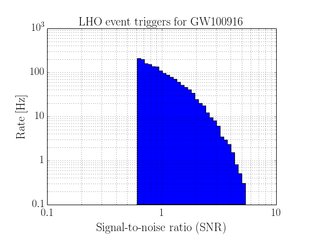
I would like to signal-to-noise ratio distribution in the event triggers generated by the ExcessPower gravitational-wave burst detection algorithm (LIGO.ORG credentials required) , over a small stretch of data.
The below events were generated by an analysis of data surrounding a potential gravitational-wave candidate GW100916. Please see this data release announcement for more details on this simulated signal and its analysis.
Solution
The test data we will use are packaged with the GWpy source code, so we can read that file directly from our position within the examples/ directory.
>>> from gwpy.table.lsctables import SnglBurstTable
>>> events = SnglBurstTable.read('../gwpy/tests/data/'
                                 'H1-LDAS_STRAIN-968654552-10.xml.gz')
Now, we can use the hist() method to make a scatter plot of events in frequency versus time
>>> plot = events.hist('snr', weights=1/10., log=True, logbins=True,
                       histtype='stepfilled', cumulative=-1)
>>> plot.set_xlabel('Signal-to-noise ratio (SNR)')
>>> plot.set_ylabel('Rate [Hz]')
>>> plot.set_title('LHO event triggers for GW100916')
>>> plot.show()
(Source code, png)